


This website is better in terms of finishing, and the different styles and effects used.
The Cascades has a different concept from Lake Edge. The Cascades is about modern entertainment and fun in the city life. An icon to a city. A different approach from Lake Edge. And this website successfully give me the feeling of a fun and night life city with the changing background every few seconds of the night view.
The Glades


This website looks more finished than Lake Edge. Beautiful images. The font type chosen gives a higher class feeling, feels more expensive compared to Lake Edge. The colour scheme of the website feels a little old, maybe because they are targeting older people with families? The registration feels so important that it has to be there all the time is a bit distracting. And the way the information is shown is unusual in that location and makes me feel uncomfortable like something is blocking my vision.
Jade Hills

This website is very complete. Features effects when pictures and text shows up and the whole scrolling thing. But i feel its a bit too much for me. Sort of like trying too hard. Too much effects going on that i think some are inconsistent. Font style is inconsistent as well in every page. Just feel like its too much going on and it makes the whole thing looks cheap. I feel like their target audience are aunties and uncles who are looking for cheap big house -.-
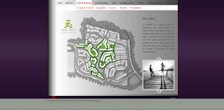
The PARC


The PARC is an exclusive residence. Only the logo looks exclusive and rich and elegant, the rest of the website not so much. The colour scheme is almost there. The website is lacking of design treatment, its too simple the square shape. The font used doesn't match the exclusivity. The picture in the homepage, the clouds are actually moving so its cool. Besides that the other pictures nothing special, lack of pictures as a matter affect.
The Glades


This website looks more finished than Lake Edge. Beautiful images. The font type chosen gives a higher class feeling, feels more expensive compared to Lake Edge. The colour scheme of the website feels a little old, maybe because they are targeting older people with families? The registration feels so important that it has to be there all the time is a bit distracting. And the way the information is shown is unusual in that location and makes me feel uncomfortable like something is blocking my vision.
Jade Hills


This website is very complete. Features effects when pictures and text shows up and the whole scrolling thing. But i feel its a bit too much for me. Sort of like trying too hard. Too much effects going on that i think some are inconsistent. Font style is inconsistent as well in every page. Just feel like its too much going on and it makes the whole thing looks cheap. I feel like their target audience are aunties and uncles who are looking for cheap big house -.-
The PARC


The PARC is an exclusive residence. Only the logo looks exclusive and rich and elegant, the rest of the website not so much. The colour scheme is almost there. The website is lacking of design treatment, its too simple the square shape. The font used doesn't match the exclusivity. The picture in the homepage, the clouds are actually moving so its cool. Besides that the other pictures nothing special, lack of pictures as a matter affect.
No comments:
Post a Comment