Monday, February 13, 2012

IAMM Field Trip


1) IAMM's mission is to educate and give knowledge people about the Islamic art.

2) After this trip, the audience will get a better understanding about Islamic art. Where they come from, what they look like and why. It widens the mind, gives us a bigger picture of the Islamic art. Its good to see not just the usual architecture, but jewellery, ceramic, textile and etc as well. Also, each artifact contains interesting history and some might artifacts even surprise us. (IE, the giant candle stick holder). Besides that, from a personal point of view, i feel that is it more effective and interesting to be on the field and seeing these things yourself compared to just seeing it in image form. Overall a very interesting experience.

3) I feel that the museum's ambiance and environment is very white. In a good way. I'm not sure how they would want us to feel, but stepping in, the white walls and floors gives a very spiritual, pure feeling. I was expecting to see extravagant or lavish decorations, but it was keep to very simple. Also the big space is very nice as it allows us to move around the artifacts with no trouble. I was very very impressed by the decorations under the dome. I love how detailed and beautiful it looks. The big glass windows using natural sunlight to shine in actually gives the interior a more holy and clean feel as well.


4) 


I'm still very curious about the architecture of mosques. What makes a mosque, a mosque? Are there any certain elements that is a must have in a mosque? Must a mosque be big and have wide open areas? Based on what i learned in SEA culture class, not all mosque must have a dome. But i was still curious why do so many mosque adapt the usage of domes? Well, in this field trip, the tour guide finally answered my question. He said that the shape of the dome can help send sound waves to alot of areas of the mosque even when the volume is soft. This was proven when during in the museum, the prayer was playing far far away and i still can hear it


There is also another thing i am curious and would love to know about. The patterns. The geometric and symmetric pattern that has been adapted to most of  Islamic arts. Their tiles, their ceramic, their textiles. And the star symbol that they often use. Why the star? And does it matter the number of sides the star has? What is the symbolic meaning of the star? This particular topic may not be in the exhibit, but i was curious about this topic whenever i see a different design in the domes in the building. The designs are different, the shapes are different but somehow you know they belong to Islamic art.


5) There is this calligraphy painting or textile (kinda forgot what medium), that was drawn/made using smaller calligraphy. I kinda feel that at first glance, the Islamic art may look quite simple but when you look closer, there is something else inside of it. Its actually pretty damn complicated.


6) i) I see alot of green and blue colour used in the Islamic art. Any particular reason to it?
    ii) How did the usage of geometrical pattern started as an Islamic art?
 

Thursday, September 8, 2011

Web Design 2 - Tutorials

Tutorials for HTML & Codings.


Design Tutorials

Web Design 2 - Beautiful Website


Simple, classy. Typeface used is nice and suitable. Colour scheme is simple and clean with a hint of classy-ness. Unusual choice of colour to go with grey. Navigation and buttons are nicely done. The shapes look simple but it suits the whole theme. Very organized


Fun graphics and colour scheme. Pleasant to the eyes. Typeface used is suitable to the theme of fun but not too much. Very organized. Element of fun but yet still simple. Navigation is normal. 


Obvious hierarchy. Typeface used is simple, the different font size is obvious. Images are well put together. Background image changes in every page, and it suits. Feels young and professional.


Very very simple and minimalist. Colour scheme is simple. It would look very boring but thanks to the header on top with the grungy watercolour texture it compliments and balance the page. Font size maybe a bit too small. Super organized. Hierarchy is there.

Web Design 2 - Competitors


This website is better in terms of finishing, and the different styles and effects used. 
The Cascades has a different concept from Lake Edge. The Cascades is about modern entertainment and fun in the city life. An icon to a city. A different approach from Lake Edge. And this website successfully give me the feeling of a fun and night life city with the changing background every few seconds of the night view.


The Glades


This website looks more finished than Lake Edge. Beautiful images. The font type chosen gives a higher class feeling, feels more expensive compared to Lake Edge. The colour scheme of the website feels a little old, maybe because they are targeting older people with families? The registration feels so important that it has to be there all the time is a bit distracting. And the way the information is shown is unusual in that location and makes me feel uncomfortable like something is blocking my vision.


Jade Hills


This website is very complete. Features effects when pictures and text shows up and the whole scrolling thing. But i feel its a bit too much for me. Sort of like trying too hard. Too much effects going on that i think some are inconsistent. Font style is inconsistent as well in every page. Just feel like its too much going on and it makes the whole thing looks cheap. I feel like their target audience are aunties and uncles who are looking for cheap big house -.-


The PARC


The PARC is an exclusive residence. Only the logo looks exclusive and rich and elegant, the rest of the website not so much. The colour scheme is almost there. The website is lacking of design treatment, its too simple the square shape. The font used doesn't match the exclusivity. The picture in the homepage, the clouds are actually moving so its cool. Besides that the other pictures nothing special, lack of pictures as a matter affect.


Web Design 2 - Lake Edge Puchong

My client would be Lake Edge Puchong
Here's the link of the website.

The home page of the website. Looks very modern, simple, clean, sophisticated.


This is how the overview page looks like.
Alot of text on the top, all jumbled up i won't read it because its too much. The images are very nice quality and fresh looking. 


Overall the whole website's pages look like that. A chunk of text on the top followed by a big picture. And the bottom of the page has a disclaimer from the developer. There is a language change to korean, i don't know what is the reason, is their target audience include Koreans? And there is no sound also there is a sound button. 


What I like about the website :
- The transitioning of the pictures when you go another page, the images transitions from a line and the line is from the home page of the website, so the line feels very symbolic for this project throughout the website

- The pictures

- The font type


What I don't like about the website:
- The big chunk of text in every page. I think it could  be cut down or arranged properly.

- The hierarchy of text could be more obvious.

- The style of clean and simple, its TOO simple. Looks like an incomplete work.

Web Design 2 - Gantt Chart & Site Map


Sunday, August 28, 2011

Typography for Digital Media


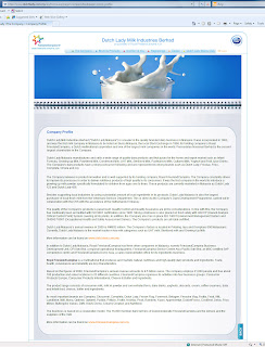
(Before)


(After)


My first assignment, to redesign the Dutch Lady website. Given two screenshots, i only have to redo two of the pages. Have to take care of typography, typeface used and placement of paragraphs.


(Before)


(After)


Mobile interface. Find a boring app and redesign it. Define hierarchy and choose the typeface to match the company. Also making it more interesting and easy to understand.


My final project movie poster. 
Create a story in groups and then create a poster yourself.

Photo is taken by me. 
Choosing the typeface properly to show the movie.

Classic, graceful, sorta expensive feeling.